Book Cover Design
Little Women is an American Classic, and while Louisa May Alcott may have complained about the "moral fluff" contained in its pages, the story of four sisters coming of age in Civil War America endures today.
After reading the book, I was fascinated by its simple elegance. I wanted my book covers to feel friendly, quiet yet captivating, and sweet. The book, after all, is made for young girls, but I didn't want to feel like only little girls can read it.
I began my process by researching. While I had read the book and watched several show and movie adaptations, I looked into the reason why Alcott wrote it in the first place as well as the deeper symbolism contained in its pages. I also looked at Little Women book covers previously in publication.
Originally, I wanted to take a completely different approach than the other book covers and make mine darker and more mature. However, I quickly scrapped that idea because that would make the story something that it is not. Instead, I searched for more story-appropriate symbols and imagery.


I played with flower imagery; flowers are elegant and feminine, yet hold deep symbolism. Maybe a flower for each sister?
I also liked the idea of a pen, since Jo, the oldest sister, uses it to escape and mature,
as well as tell the story of her family. The family's home also surfaced as a possibility as a symbol of family, and because it is where most of the story takes place.
While I ended up deviating from it, I also liked the idea of incorporating symbols of America, such as the flag, since the story is an "American Classic" and the characters are quite patriotic.
When the sketches made it to the computer, I changed focus to composition and feel. I went through countless computer compositions for each cover until I achieved the right feel.
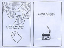
The first finished cover focuses on the house the four "little women" live in, which is actually modeled after Alcott's own New England home. The pen in the smoke leaving the chimney is meant to symbolize the eldest sister's ability to leave home through writing. It is also her writing that brings what happens in the home to the outside world.
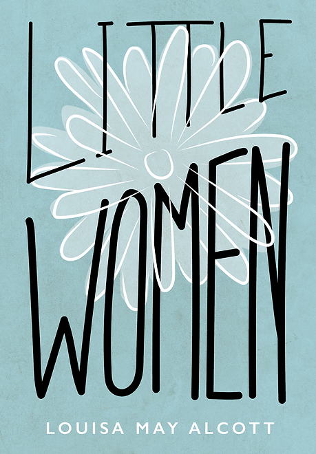
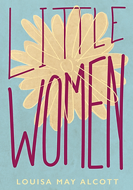
In the second cover, I wanted the type to be dominant and have meaning in itself. "Little" becomes smaller and "Women" becomes larger, symbolizing maturity. The flower is also a symbol of "blossoming into adulthood." I changed the carnation to a daisy because it better shows "blossoming" and it is a symbol of purity and women.


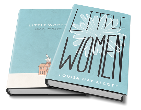
Final Designs