Theater Poster
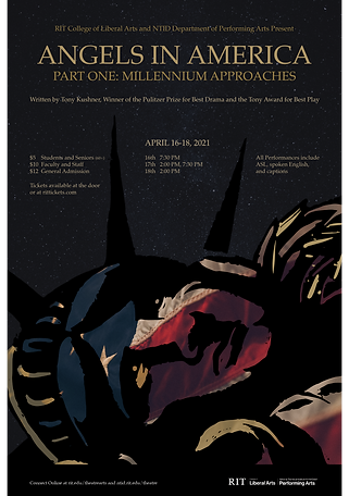
Each year, the RIT College of Liberal Arts and NTID Department of Performing Arts put on a show. Their 2021 production is Angels in America, Part One: Millenium Approaches.
The show focuses on two couples, one straight and one gay, during the AIDS epidemic in the United States in 1980's New York City. It has been described as a "gay fantasia on national themes."
After meeting with the director and collecting his thoughts on the production, I gathered my own research. This, in combination with watching HBO's adaptation, gave me a lot to think about.
Angels in America is filled with symbolic imagery and deeper meaning; the plot is only the surface. I created word webs to connect the themes and important symbols to tangible imagery. This also helped me get a better idea of how I wanted the poster to feel.


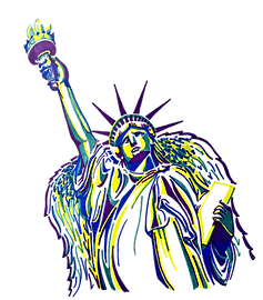
Sketching and thumbnails came next. I originally wanted to do a graffiti style, playing off of the New York City streets and the idea of "in the cover of darkness," since graffiti is never made out in the open.
The Statue of Liberty also seemed like a strong symbol. She stands for liberty, but what does that mean? She is a strong symbol for America, but what is she looks sad? Adding wings, making her the angel, also seemed like a strong choice.
I narrowed my thumbnails down to two compositions. One, with the statue on an angel, felt dynamic and a bit uneasy. Whereas, the other has the statue laying down, which felt like "liberty taking a rest."
The next step was creating imagery. The director mentioned that blue, green, yellow, and purple are in the script as the colors shown when the angel appears. Therefore, I thought that they'd be a nice choice to use in my statue imagery.


I created numerous variations for both compositions once I brought them into Illustrator. It became clear that the statue laying was the stronger composition, so I began to focus on it.
I also deviated from the four colors in an attempt to make it feel more mature with quiet dignity. Changing the type from graffiti to Palatino also aided in this.
In my original layouts, the Statue of Liberty looked flat, so I decided to place an image behind it instead of flat color. I chose a dramatic image of the American Flag, furthering the national theme.
The wing was getting lost on the statue, so I highlighted it with gold and more detail. After I did this, I experimented with highlighting other areas of the statue. These gold accents made it into the final design.


Final Poster
